7 Best Practices to Build a Perfect Product Page for Shopify
The product page is the most important page of your e-commerce store. Your well-structured product page can differentiate you from other mediocre e-commerce brands. So, every minute detail of the product page needs to be specially planned and designed. The content of the page and its arrangement are of utmost importance here. These should be attractive enough to entice your potential customers. By paying a little attention to these, you can convert even casual browsers into buyers.

Listed below are some of the best practices that you could adopt while building a product page for your Shopify brand:
1. Include high-quality content
A clear product description helps the customers make informed shopping decisions. An ideal product description should be informative as well as entertaining. You can create entertaining content by using creative product descriptions and original photos/videos.
Components like product name, product description and call to action are integral parts of your product page.
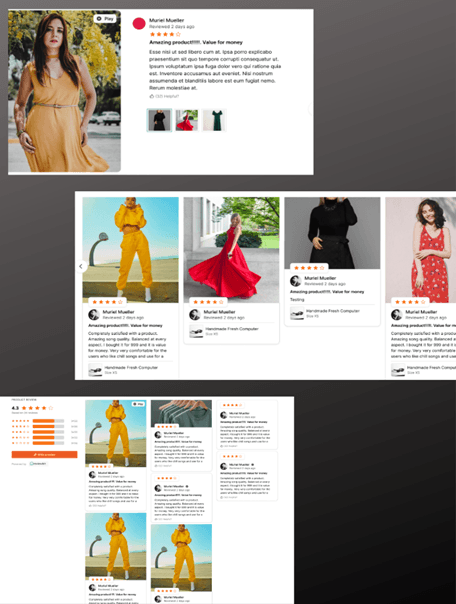
Others like customer reviews, , etc can be added to your product page to grab the attention of your buyers.
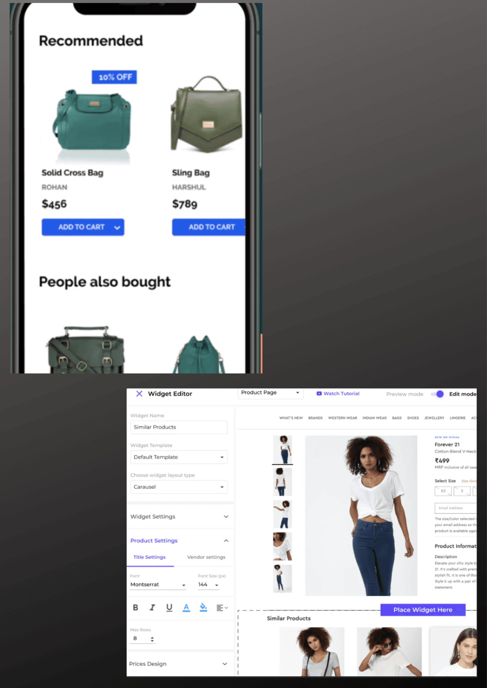
Shopify has many interesting applications that help you collect and add . Incorporating similar but high-end products or products that are usually bought together on your product page is a great tactic for boosting your average order value. is a Shopify app that can help you provide AI backed product recommendations for your customers.
2. Plan the layout well
Arrangement of the components is equally important as including high-quality content. Your product page’s appearance has a big impact on sales.
Product pages of e-commerce stores normally follow a standard layout where the images are displayed prominently on the left side and the product description on the right. Below this, you can find the pricing, customization options, and call to action. It would be better that you follow a layout similar to the ones that are normally found in other stores in your category. If you try a layout that is totally unfamiliar to your customers just to stand out from your competitors, it might actually create a negative impact.
The components on the product page should be arranged in a way that triggers the buyers to take action. Declutter your product page and make sure you add only those elements that are required depending on the nature of your product. Use plenty of white space to give the page a clutter-free look.
3. Add professional and user-generated photos & videos
Add both professional photographs as well as to your product page. You can showcase your products in high-quality professional images. But, photos and videos from your buyers, though of lesser quality, will be trusted more than any professional image that you post on a product page. They act as a powerful form of social proof.
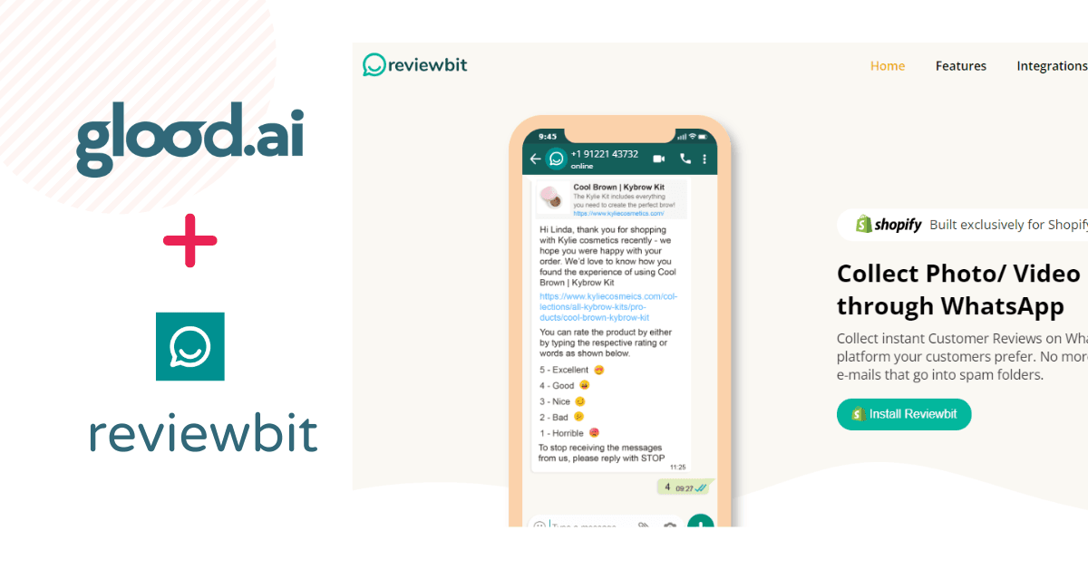
Shopify review app, can help you collect photos and video reviews from your customers through WhatsApp. These photos and videos can be showcased on your product page in eye-catching widgets. Reviewbit has different types of display widgets that can be completely customized to suit your website’s theme. To know more about the app and add it to your store, visit
4. Add a prominent call-to-action
A call-to-action (CTA) button triggers the buyers toward the next step to be taken. It helps them get what they want with the least friction. In the case of CTAs there are certain best practices that you can adopt to improve your conversion rates.
Make your CTA stand out from the other elements of your product page. The color, shape and size of the CTA button will be dependent on the other elements of your page. There is no proven data that can tell you which color, shape, or size works best. You can experiment with them and try out different options to determine which one has more conversion rate.
You can also experiment with the copy of your CTA button. Copy should be kept minimal and should contain action-oriented words.
CTAs should be placed in a position where they can be easily spotted, preferably with lots of white space around them. Placing it above the fold of the web page is found to be most effective.
Make sure to avoid multiple CTAs on a single page as it might confuse the buyers. An Add to Cart and Buy Now would be sufficient for a product page.
5. Create a sense of urgency
With multiple options available online, people tend to look out for different options and postpone their purchase decisions. You can create a sense of urgency in the buyers by adding countdown timers, limited-period discounts, or live sales notifications to your product page. Fear of missing out will make them take quick shopping decisions. It might also prompt impulsive buys.
6. Add a social sharing button
Most of your online shoppers these days will be using one or the other social media platforms. A social sharing button will let them share their purchases directly on Instagram, Facebook, Twitter etc which will act as a free promotion for your store.
7. Add a meta description to your product page
Meta descriptions play a significant role in search engine optimization. A compelling meta description can improve your click-through rate and bring more traffic to your product page. Adding product name and category to your page’s URL is yet another method to lead targeted traffic to your page.
You can optimize your conversion rates by following the above-mentioned best practices while setting up your product page. Whatever tactics you employ to enhance your product page, make sure that you have an intuitive, easy-to-navigate UI. Even those who can’t read and follow your beautifully worded product descriptions should be able to choose the product and add it to the cart easily. A good product page would give enough details about the product and motivate window shoppers to make a purchase whereas a complicated layout might frustrate the users and they might drop their shopping plan altogether.
Download Our Free E-Book And Get Started Today!
Subtext supporting the title. Lorem ipsum dolor sit amet consectetur. Turpis ullamcorper volutpat augue.
